
Parkinson’s Disease Progression
Project Objective
Parkinson’s disease is a devastating neurodegenerative disease that affects 20/100,000 people and occurrence frequency is expected to increase as the population ages [1]. The disease progressively removes the ability to move, speak, and think clearly. Vocal impairment affects approximately of Parkinson’s patients [2] with hypophonia (degradation of voice volume) and dysphonia (breathiness or hoarseness). These factors are part of a score which predicts the stage of the disease a patient is in, known as the Total Unified Parkinson’s Disease Rating Scale, or Total UPDRS, which ranges from 0-176, with 176 representing complete debilitation. This score is complemented by Motor UPDRS, which tracks a subset of the total score, including vocal hoarseness and movement abilities.
Although Parkinson’s disease currently has no cure, symptoms can be treated using a variety of medications and surgeries. Accurate monitoring of where a patient is at in the disease spectrum can then allow clinics to prescribe treatments at the appropriate time in order to alleviate certain aspects of the disease. This study looks at remote monitoring via electronic recordings which can be produced at a patient’s home. Remote monitoring using telephone recordings would reduce patient traffic at treatment facilities and reduce the burden on national health systems. Additionally, predicting UPDRS scores with machine learning would remove clinician bias and subjectivity, allowing for more systematic predictions.
In 2010, a group published a paper which took a large dataset generated from 42 patients with Parkinson’s disease. This dataset was generated by having patient’s homes fitted with a piece of equipment installed on their personal computers. This device prompted the patients to make periodic recordings of their voices; patients produced elongated vowel sounds (the vowel “a”) into a microphone and the device broke the voice recording into a series of metrics. The dataset used in this study comes from [3]. UPDRS scores were assessed at the beginning of the study, at the half way point, and at the end. The study was 6 months long, and each patient made multiple vocal recordings. Because only 3 recordings were scored by clinicians, the remaining recordings were scored using linear interpolation. This interpolation is justified in various studies [4][3].
Previously published results found that, using linear regression with Lasso technique to reduce feature set dimensions, total UPDRS scores could be predicted to within Mean Square Error (MSE). Here, I will show that implementing an artificial neural network decreases this MSE by up to .
Data Categories and Cleaning
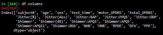
The data can be read in with a pandas csv read command. Columns in the data are shown below
Column descriptions are as follows:
-‘subject#’: the number assigned to a subject
-‘age’: the age of the corresponding subject
-‘sex’: the sex of the subject
-‘test_time’: the integer number of days since the beginning of the study
-‘motor_UPDRS’: the motor UPDRS score (subset of total UPDRS)
-‘total_UPDRS’: the label to predict; describes the severity of the disease
-‘Jitter(%)’, ‘Jitter(Abs)’, ‘Jitter:RAP’, ‘Jitter:PPQ5’, ‘Jitter:DDP’: measures of variation in fundamental vocal frequency
-‘Shimmer’, ‘Shimmer(dB)’, ‘Shimmer:APQ3’, ‘Shimmer:APQ5’, ‘Shimmer:APQ11’, ‘Shimmer:DDA’: measures of variation in fundamental vocal amplitude
-‘NHR’, ‘HNR’: Noise to Harmonic Ratio and Harmonic to Noise Ratio
-‘RPDE’: recurrence period density entropy; ability of vocal chords to maintain simple vibrations
-‘DFA’: detrended fluctuation analysis; extent of turbulent noise in vocal patterns
-‘PPE’: pitch period entropy; evaluation of stable pitch control during sustained phonations
The categories Jitter and Shimmer are, as one might imagine, highly correlated, and details on each subcategory of Jitter and Shimmer can be found at [5]. A preliminary glance at the categories would indicate that many will be correlated and a type of feature reduction technique will need to be employed. Before getting to this, data cleaning needs to be completed. As a first step, one can see that the column ‘test_time’ has several negative values which are likely typographical errors. This can be remedied using the following code:
df['test_time'].abs().
The next step in data cleaning is to look for outliers. This can be done using z_score. Z_score standardizes data, and replaces a data value by the number of standard deviations a points is above or below its category mean. A standard normal distribution accounts for standard deviations, so I will remove data which lies beyond this value.
z_score = np.abs(stats.zscore(df))
df_new=df[(z_score<3.1).all(axis=1)]
Next, preprocessing will be used to scale the remaining data by subtracting off the mean and dividing by the standard deviation. This is done with a simple
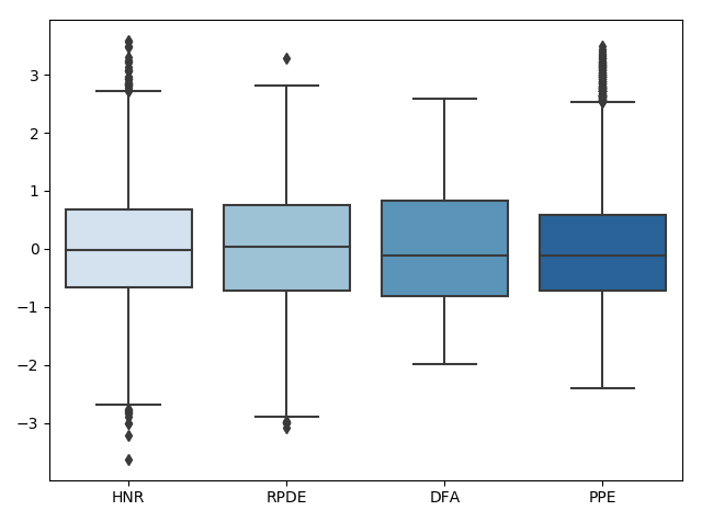
preprocessing.scalecommand. We can visualize what is happening to the data during this process using box plots (shown only for select categories for visualization purposes). First the data is read in:
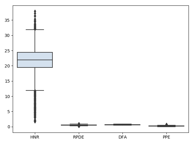
Next, the data is scaled:
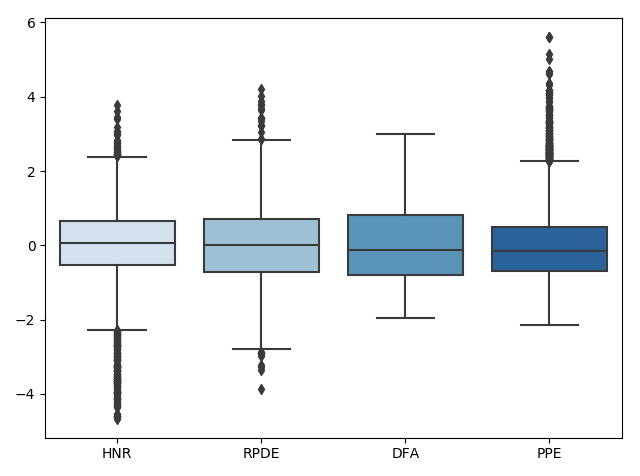
Lastly, the data outliers are removed:
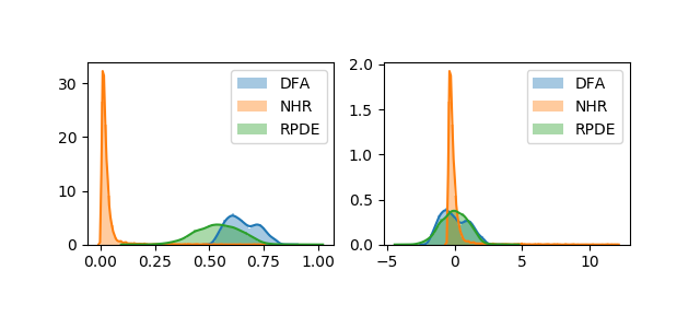
We can look at how this affects the corresponding distributions using the following code:
plt.figure(2)
plt.subplot(2, 2, 1)
sns.distplot(df["DFA"])
sns.distplot(df["NHR"])
sns.distplot(df["RPDE"])
plt.xlabel('')
plt.legend(['DFA','NHR','RPDE'])

plt.subplot(2, 2, 2)
sns.distplot(preprocessing.scale(df["DFA"]))
sns.distplot(preprocessing.scale(df["NHR"]))
sns.distplot(preprocessing.scale(df["RPDE"]))
plt.legend(['DFA','NHR','RPDE'])
Which produces the following figure:
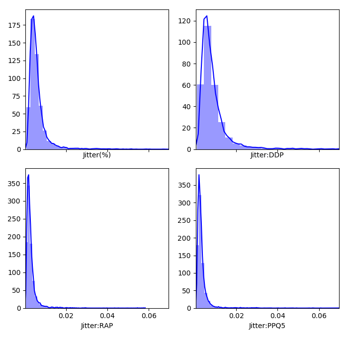
We can get an idea of what the distributions of the feature dimensions look like before standardization with a histogram (only a piece of the code is shown because it is similar for the other categories):
plt.figure(1)
f, axes = plt.subplots(2, 2, figsize=(7, 7), sharex=True,tight_layout=True)
sns.distplot( df["Jitter(%)"] , color="blue", ax=axes[0, 0])

sns.distplot( df["Jitter:DDP"] , color="blue", ax=axes[0, 1])

sns.distplot( df["Jitter:RAP"] , color="blue", ax=axes[1, 0])

sns.distplot( df["Jitter:PPQ5"] , color="blue", ax=axes[1, 1])
Which produces
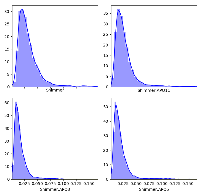
Now we can look at the remaining categories, where here the highest frequencies are plotted with the hotter colors (again, code is only shown for a selection of subplots due to similarity)
plt.figure(5)
ax1 = plt.subplot(231)
n, bins, patches = ax1.hist(df["NHR"],40, normed=1, color='green')
cm = plt.cm.get_cmap('RdYlBu_r')
col = (n-n.min())/(n.max()-n.min())
for c, p in zip(col, patches):
    plt.setp(p, 'facecolor', cm(c))
ax1.set_xlabel('NHR')
plt.tight_layout()

ax2 = plt.subplot(232)
n, bins, patches = ax2.hist(df["HNR"],40, normed=1, color='green')
cm = plt.cm.get_cmap('RdYlBu_r')
col = (n-n.min())/(n.max()-n.min())
for c, p in zip(col, patches):
    plt.setp(p, 'facecolor', cm(c))
ax2.set_xlabel('HNR')
plt.tight_layout()
Lastly, we can look for missing values with a simple code:
#look for missing values
val = df.isnull()
cols = df.columns
for i in cols:
  print(val[i].value_counts())
which shows that there are no missing values. So at this point, the data is standardized, missing values taken care of, and outliers removed. Now we can move on to an exploratory analysis.
Exploratory Data Analysis
After getting an idea of what the data looks like and cleaning it, the next step is to look at how the features relate to one another. This will be done in several parts. The first part will be to look at how the feature dimensions relate to each other through the use of a correlation matrix.
    #correlation matrix
    corr=df.corr()
    plt.figure(1)
    ax=sns.heatmap(corr, mask=np.zeros_like(corr, dtype=np.bool), cmap=sns.diverging_palette(220, 10, as_cmap=True),
            square=True, vmin=-1, vmax=1)
    ax.figure.tight_layout()
which produces the following figure
We can see that, as expected, the Jitter and Shimmer categories are highly correlated amongst themselves. We can zoom in on each to get a better look:
    df_jitter = df[['Jitter(%)','Jitter(Abs)','Jitter:RAP','Jitter:PPQ5','Jitter:DDP']]
    corr_jitter=df_jitter.corr()
    plt.figure(2)
    axjitt=sns.heatmap(corr_jitter, mask=np.zeros_like(corr_jitter, dtype=np.bool), cmap=sns.diverging_palette(220, 10, as_cmap=True),
            square=True,vmin=-1, vmax=1,annot=True)
    axjitt.figure.tight_layout()


    df_shimmer = df[['Shimmer','Shimmer(dB)','Shimmer:APQ3','Shimmer:APQ5','Shimmer:APQ11','Shimmer:DDA']]
    corr_shimmer=df_shimmer.corr()
    plt.figure(3)
    axshim=sns.heatmap(corr_shimmer, mask=np.zeros_like(corr_shimmer, dtype=np.bool), cmap=sns.diverging_palette(220, 10, as_cmap=True),
            square=True,vmin=-1, vmax=1,annot=True)
    axshim.figure.tight_layout()
We can now see the zoomed correlation matrices for both the Jitter and Shimmer categories. The values close to 1 throughout the entire matrices indicates a high correlation between two features.
It could be interesting to look at how time relates to total UPDRS score. In reference [3], it is stated that a more or less positive linear correlation exists between time and disease score. We can look at a bivariate distribution using Seaborn to see how the two feature dimensions ‘test_time’ and ‘total_UPDRS’ relate to each other. Darker areas in the plot indicate high correlation areas.
    plt.figure(1)
    ax_marg=sns.jointplot(x=df_new["test_time"], y=df_new["total_UPDRS"], kind='kde', color='b',space=0)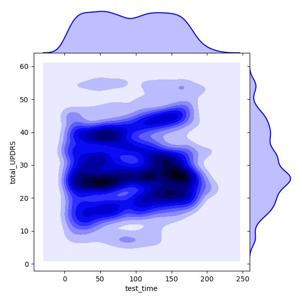
From the above we can see that there is a lot of overlap between the two variables, and it might be worth digging further to see what kind of relationship exists. A relationship addressed here is that between gender and disease progression rate. Each of the 42 patients, both male and female, can have their respective ‘test_time’ vs ‘total_UPDRS’ plot created. Then, for each patient, we can look at a regression fit to their data. Because we will only be looking at data of dimension , we can take the coefficients of the fit and average them over each gender to get a disease progression rate for each sex. First, we will separate the men and women
    #separate men from women
    df_male = df_new.loc[df_new['sex']==0]

    df_female = df_new.loc[df_new['sex']==1]

    unique_male = list(set(df_male['subject#']))

    unique_female = list(set(df_female['subject#']))

    #create dictionary to store lin fit parameters
    male_dic = {}
    female_dic = {}
Next, we will iterate over each male and find the regression fit and parameters of the fit, and store them in a dictionary.
    for male in unique_male:
      temp_df = df_male[df_male['subject#']==male]
      temp_x = preprocessing.scale(temp_df['test_time'])
      temp_y = np.array(temp_df['total_UPDRS'])
      temp_x=temp_x.reshape(len(temp_x),1)
      temp_y=temp_y.reshape(len(temp_y),1)
      X_train, X_test, y_train, y_test = train_test_split((temp_x), (temp_y), test_size=0.33, random_state=42)
      regr = linear_model.LinearRegression()
      regr.fit(X_train, y_train)
      pred = regr.predict(X_test)
      MSE = mean_squared_error(y_test, pred)
      coef = regr.coef_
      male_dic[male] = [MSE, coef]
Next, we will do the same for the females, except this time will generate a few plots for visualization purposes.
    for female in unique_female:
      temp_df_female = df_female[df_female['subject#']==female]
      temp_x = preprocessing.scale(temp_df_female['test_time'])
      temp_y = np.array(temp_df_female['total_UPDRS'])
      temp_x=temp_x.reshape(len(temp_x),1)
      temp_y=temp_y.reshape(len(temp_y),1)
      X_train, X_test, y_train, y_test = train_test_split((temp_x), (temp_y), test_size=0.33, random_state=42)
      regr = linear_model.LinearRegression()
      regr.fit(X_train, y_train)
      pred = regr.predict(X_test)
      MSE = mean_squared_error(y_test, pred)
      coef = regr.coef_
      female_dic[female] = [MSE, coef]
      plt.figure(female)
      plt.scatter(X_test, y_test,  color='black')
      plt.xlabel('test_time')
      plt.ylabel('total_UPDRS')
      plt.xticks(())
      plt.yticks(())
      plt.plot(X_test, pred, color='red',linewidth=3)
      plt.show()
Now we have the MSE and fit coefficients stored in a dictionary for males and females. The next step is to average each to get the class averages.
    male_coef = []
    female_coef = []

    for male in male_dic:
      male_coef.append(float(male_dic[male][1]))

    for female in female_dic:
      female_coef.append(float(female_dic[female][1]))

    male_average_coef = sum(male_coef)/float(len(male_coef))

    female_average_coef = sum(female_coef)/float(len(female_coef))

    smallest_average = []
    greatest_average = []
    if male_average_coef > female_average_coef:
      greatest_average.append('male_average_coef')
      greatest_average.append(male_average_coef)
      smallest_average.append('female_average_coef')
      smallest_average.append(female_average_coef)
    else:
      greatest_average.append('female_average_coef')
      greatest_average.append(female_average_coef)
      smallest_average.append('male_average_coef')
      smallest_average.append(male_average_coef)

    print('average male rate of increase is', male_average_coef)
    print('average female rate of increase is', female_average_coef)

    print('the', greatest_average[0], 'rate of increase is',
          100*(greatest_average[1]-smallest_average[1])/smallest_average[1], '% greater than the ',
          smallest_average[0])
The above code produces (only select few shown) the following plots (Subject number appears at the top of the plot. The red line is an overlay of the regression fit):
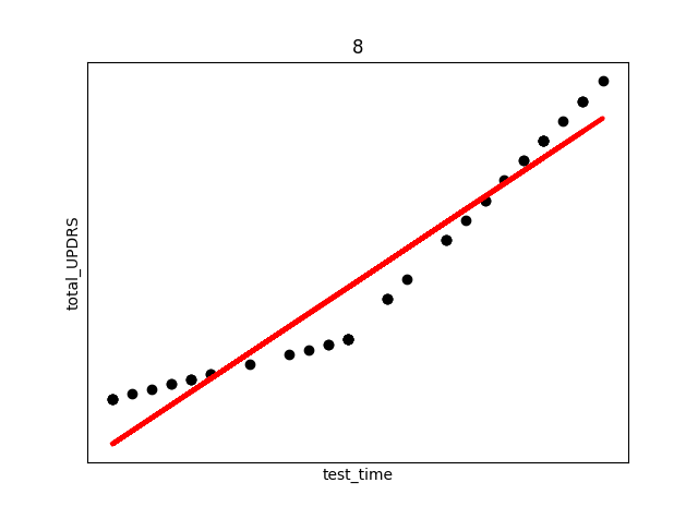
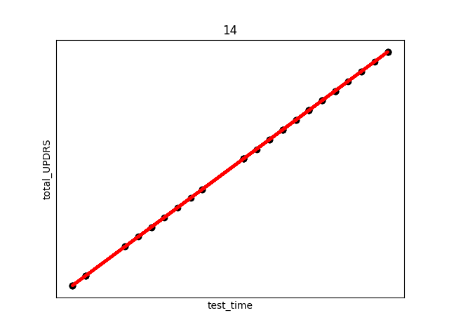
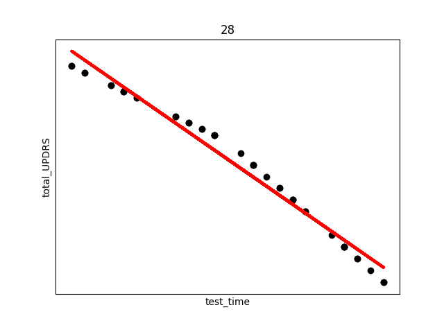
There are several things to note from the above plots. First, in each plot there are three “kinks”. At the beginning, middle, and end. This is due to the previously discussed fact that UPDRS scores were hand evaluated only at the start, halfway point, and end of the study. Additional points were derived using linear interpolation. This explains the near exact fit for many of the points.
Secondly, and perhaps most interestingly, we see in subject 28 a decrease in UPDRS score as time progresses. This could indicate that the assumption of the appropriateness of linear interpolation could be overstated in the original study, or that the time period the data collection took place over needs to be longer in order to establish a more accurate long term trend where disease symptoms increase over time. Subjects were not on any medication during this study, so any increase or decrease in severity is due only to natural causes.
The average disease progression rates for men can be shown to be , with units of total_UPDRS/day, compared to the female , showing a slower progression in men compared to women. Reasons for this are best left to a medical professional to evaluate.
Lastly in our exploratory analysis, we will look at clustering to see what group attributes after using a Principle Component Analysis (PCA) reduction. We begin by first completing a PCA on the data. Starting with x_data and y_data as the features and labels, respectively:
    x_train, x_test, y_train, y_test = train_test_split(preprocessing.scale(x_data), y_data, test_size=0.33, random_state=42)


    pca = PCA().fit(x_train)
    plt.figure(1)
    plt.plot(np.cumsum(pca.explained_variance_ratio_))
    plt.xlabel('number of components')
    plt.ylabel('cumulative explained variance')
    plt.show()

    #call in the PCA to explain 97% of variance
    V=.97
    pca = PCA(V)

    pca.fit(x_train)

    n_components = pca.n_components_
    print('the number of chosen components is', n_components, 'which explain', 100*V,'% of the variance')

    #apply the PCA to the train and test sets to transform them

    x_train = pca.transform(x_train)
    x_test = pca.transform(x_test)
    df_target = df_new['total_UPDRS']
    df_data = df_new.drop(['total_UPDRS'], axis=1)

    #for KMeans will transform whole data set and put targets back in
    df_data = pd.DataFrame(pca.transform(df_new))
    #new fully transformed dataframe
    df_PCA_transformed = pd.concat([df_data.reset_index(drop=True),df_target.reset_index(drop=True)], axis=1)
In the above code, first the PCA is fitted on the features. The PCA is called to account for of the variance, which amounts to 11 principle components. Next, the data is transformed using the PCA. The plot below shows how changing the number of PC’s to keep in the analysis preserves the variance of the original data.
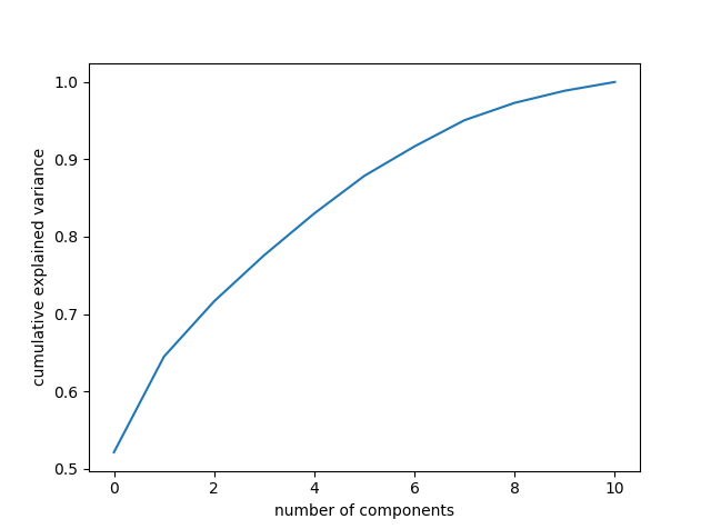
Keeping 11 components accounts for a large percentage of the variance, so more are not necessary. We can look at how each principle component counts individually using the following
    plt.figure(2)
    PCA_df.plot.bar(x=None, y='Explained_variance')
    plt.xlabel('Principle Component Label')
    plt.ylabel('Explained Variance')
    plt.show()
Which produces the following plot:
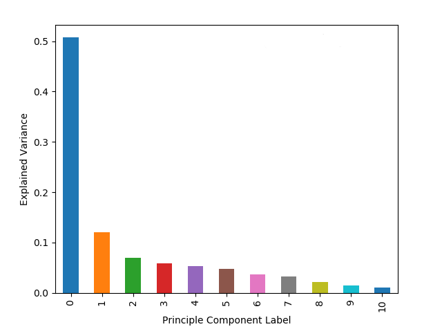
As expected from the mathematical background of PCA, the first few principle components account for a large portion of the overall variance. We can do another correlation matrix to look at how the PCA changed the components
    corr=df_PCA_transformed.corr()
    plt.figure(1)
    ax=sns.heatmap(corr, mask=np.zeros_like(corr, dtype=np.bool), cmap=sns.diverging_palette(220, 10, as_cmap=True),
            square=True, vmin=-1, vmax=1, annot=False)
    ax.figure.tight_layout()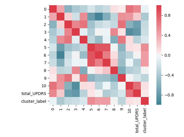
The above image clearly shows that the PCA has been effective in reducing the correlation values. There are still correlated components, but the numeric correlation values are much smaller than before.
Now we can move on to the KMeans clustering evaluation. A problem with determining the number of clusters to set K to is solved by first plotting the method km.interia_, which gives the average distance of points to their nearest cluster center. A value of zero would indicate that each point is its own cluster center. We will start to solve this by running a “for” loop over several different choices for K and plotting the K vs inertia. Additionally, a smoothing spline is plotted on top for reason to be discussed shortly.
    Sum_of_squared_distances = []
    K = range(1,15)
    for k in K:
        km = KMeans(n_clusters=k)
        km = km.fit(np.asarray(df_PCA_transformed))
        Sum_of_squared_distances.append(km.inertia_)


    #plot the smoothing spline on top of curve
    y_spl = UnivariateSpline(K,Sum_of_squared_distances,s=0,k=4)
    y_spline = y_spl(K)
    plt.figure(3)
    plt.plot(K, Sum_of_squared_distances, 'bx-', label='KMeans Values')
    plt.plot(K, y_spline, 'r', label = 'Spline Fit')
    plt.xlabel('k')
    plt.ylabel('Sum_of_squared_distances')
    plt.title('Elbow Method For Optimal k')
    plt.legend()
    plt.show()
A common method to find the optimal value for K is to use the “elbow” method. This method plots the inertia vs K, and looks for a kink in the curve to hint at what K should be set to. The resulting elbow plot is shown below:
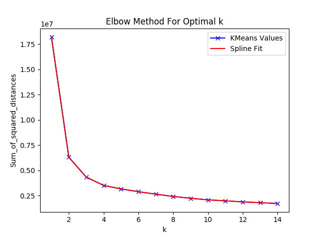
The above plot does not make it immediately clear where a kink occurs. A common trick in calculus is to look for the point at which the second derivative of a function is 0. This point is known as the inflection point. So, we will now plot the second derivative based off of the smoothing spline fitted above.
    y_spl_2d = y_spl.derivative(n=2)

    plt.figure(4)
    plt.plot(K,y_spl_2d(K))
    plt.xlabel('K value')
    plt.ylabel('Second Derivative')
    plt.show()
Which produces the following figure:
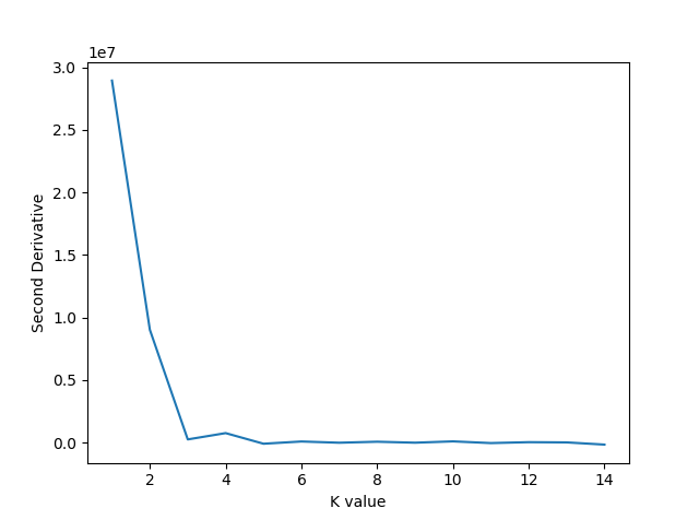
The above plot shows the second derivative becoming zero first at , which is the value we will choose for the KMeans algorithm. K Means will be implemented as follows:
    #KMeans cluster should be 5
    km = KMeans(n_clusters=5)
    km = km.fit(np.asarray(df_PCA_transformed))

    #now add cluster labels to original dataframe
    labels = km.labels_
    df_PCA_transformed['cluster_label'] = np.nan

    for i in range(len(x_data)):
      df_PCA_transformed['cluster_label'].iloc[i] = labels[i]

    df_new['cluster_label'] = np.nan

    for i in range(len(x_data)):
      df_new['cluster_label'].iloc[i] = labels[i]
The clusters can be first visualized. To do this, we will need to only keep the first 3 components, but this still allows up to account for of the variance.
    fig = plt.figure()
    ax = fig.add_subplot(111, projection='3d')
    x = np.array(df_PCA_transformed[0])
    y = np.array(df_PCA_transformed[1])
    z = np.array(df_PCA_transformed[2])

    ax.scatter(x,y,z, marker="s", c=df_PCA_transformed["cluster_label"], s=40, cmap="tab10")
    scatter1_proxy = plt.Line2D([0],[0], linestyle="none", c='royalblue', marker = 'o')
    scatter2_proxy = plt.Line2D([0],[0], linestyle="none", c='rosybrown', marker = 'o')
    scatter3_proxy = plt.Line2D([0],[0], linestyle="none", c='mediumpurple', marker = 'o')
    scatter4_proxy = plt.Line2D([0],[0], linestyle="none", c='c', marker = 'o')
    scatter5_proxy = plt.Line2D([0],[0], linestyle="none", c='green', marker = 'o')
    ax.legend([scatter1_proxy, scatter2_proxy,scatter3_proxy,scatter4_proxy,scatter5_proxy],
              ['cluster 1', 'cluster 2','cluster 3','cluster 4','cluster 5'], numpoints = 1, loc='upper left')

    ax.set_xlabel('PC 1')
    ax.set_ylabel('PC 2')
    ax.set_zlabel('PC 3')

    plt.show()
Which produces the following:
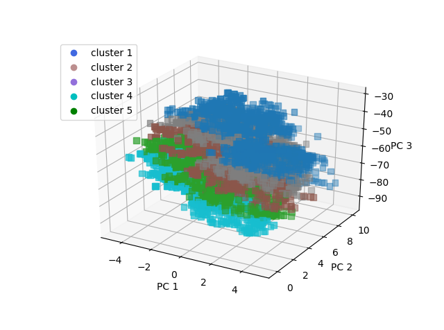
The groups have been separated into low total UPDRS, mid range UPDRS, and high UPDRS.
-Group 5 is the high UPDRS group, which consists mainly of men () and older aged people (average age 66)
-Group 4 is lower UPDRS, and mainly men who are slightly younger than group 5
-Group 3 has a higher percentage of middle age females and is mid range UPDRS score
-Group 2 has a higher percentage of older females and is also mid range UPDRS score
-Group 1 is low UPDRS score, high percentage of men, and mid range age
A KMeans analysis could be used to get a quick idea of where a patient should fall before going through a lengthy clinical evaluation.
Predictive Analysis
The first move is to establish some sort of benchmark against which to measure performance. We will start by employing a simple Support Vector Regression algorithm. First, we will check the SVR without the PCA transformed data, and then again with the transformed data.
    X_train, X_test, y_train, y_test = train_test_split(features, labels, stratify = df_new['subject#'], test_size=0.43, random_state=42)
    #look at the SVR without PCA transformed data
    SVR_noPCA = SVR(C=15.0, epsilon=0.2)
    SVR_noPCA.fit(X_train, y_train)
    pred_SVM = SVR_noPCA.predict(X_test)
    MSE_SVM = mean_squared_error(y_test, pred_SVM)
    print('MSE of the SVR is ', MSE_SVM)

    #call in the PCA to explain 97% of variance
    V=.97
    pca = PCA(V)

    pca.fit(X_train)

    X_train_PCA = pca.transform(X_train)
    X_test_PCA = pca.transform(X_test)

    #now do for whole dataset
    features_PCA = pca.transform(features)

    #now use PCA transformed data on SVR
    SVR_PCA = SVR(C=15.0, epsilon=0.2)
    SVR_PCA.fit(X_train_PCA, y_train)
    pred_SV_PCA = SVR_PCA.predict(X_test_PCA)
    MSE_SVM_PCA = mean_squared_error(y_test, pred_SV_PCA)
    print('MSE of the SVR with PCA is ', MSE_SVM_PCA)
The results of this calculation show the MSE of the SVR without PCA to be , and with the PCA to be . So the PCA seems to be helping the analysis. The default kernel for the SVR is a RBF kernel. Let’s try this again with a linear kernel and see what happens:
    #now use PCA transformed data on SVR
    SVR_PCA = SVR(kernel = 'linear', C=15.0, epsilon=0.2)
    SVR_PCA.fit(X_train_PCA, y_train)
    pred_SV_PCA = SVR_PCA.predict(X_test_PCA)
    MSE_SVM_PCA = mean_squared_error(y_test, pred_SV_PCA)
    print('MSE of the SVR with PCA is ', MSE_SVM_PCA)
And now the MSE comes out to be , a dramatic decrease in performance. This result indicates that the data is not linearly separable. A Neural Network could be a route to go to improve performance. The Artificial Neural Network (ANN) set up here will be through TensorFlow with Keras via Ubuntu; implementing a feed forward ANN to try to reduce the MSE. First (the code had to be rewritten on Ubuntu, so the starting point will be slightly different) we will make a pipeline to streamline the PCA and scaling procedure, using the StandardScaler class rather than the “scale” function to maintain the ability to inverse transform the data in the pipeline
    #separate features and labels
    features = df_new.drop(['total_UPDRS'],axis=1)
    labels = df_new[['total_UPDRS']]

    #make a pipeline for PCA and scaling
    features_pipeline = make_pipeline(StandardScaler(), PCA(n_components = .97))
    labels_pipeline = make_pipeline(StandardScaler())

    #now transform the features and labels
    features_transformed = features_pipeline.fit_transform(features)
    labels_transformed = labels_pipeline.fit_transform(labels)
Now with the features and labels tranformed and scaled, we can start cross validation. In this case we will make a validation set to use with the NN model parameters later in the code:
    #now need training, testing, and validation sets for the NN
    X_train, X_test, y_train, y_test = train_test_split(features_transformed, labels_transformed, stratify = df_new['subject#'], train_size = .9,random_state = 4422)
    X_train, X_val, y_train, y_val = train_test_split(X_train, y_train, train_size = .8,random_state=4422)

    #define an early stop for the NN using val_loss
    early_stop = EarlyStopping(monitor='val_loss', min_delta=0.001, patience=150, verbose=1)

    #variable for number of neurons per layer
    neuron_number = 100
In the above we have defined an early stop function which will be measured using validation loss. The “min_delta” is the minimum change to be qualified as an improvement, and patience the number of epoch to wait before deciding that the NN is not improving. The parameter values were determined experimentally. Next, we will build, compile, and fit the model:
    #make the model shell
    model = keras.Sequential([
		keras.layers.Dense(neuron_number, kernel_initializer='he_uniform', activation=tf.nn.relu, input_dim=(features_transformed.shape[1])),
		keras.layers.BatchNormalization(),
		keras.layers.Dense(neuron_number, kernel_initializer='he_uniform', activation=tf.nn.relu),
		keras.layers.BatchNormalization(),
		keras.layers.Dense(neuron_number, kernel_initializer='he_uniform', activation=tf.nn.relu),
		keras.layers.BatchNormalization(),
		keras.layers.Dense(1,kernel_initializer='he_uniform', activation='linear'),
		])

    #now compile the model
    model.compile(optimizer='adam', loss='mean_squared_error')
    #and fit the model
    model.fit(X_train, y_train, epochs=1500,batch_size=100, verbose=0, validation_data=(X_val, y_val), callbacks=[early_stop])
Where we have called Batch Normalization to normalize the activations of the previous layers, with the activation function called being “relu”. The model callback is the early stop define previously, and the epochs will halt once the stop criteria is met. Now we can check the MSE of the NN:
    #lastly predict and inverse transform back to original form
    predictions = model.predict(X_test)
    y_test_inverted = labels_pipeline.inverse_transform(y_test)
    predictions_inverted = labels_pipeline.inverse_transform(predictions)

    #look at MSE
    MSE = mean_squared_error(y_test_inverted[:], predictions_inverted[:])
    print('Mean Square Error of the ANN is',MSE)
        ax_marg=sns.jointplot(x=df_new["test_time"], y=df_new["total_UPDRS"], kind='kde', color='b',space=0)
One run of the NN produces a MSE of

Because the NN is not a simple convex optimization problem (there is not necessarily a global minima), we should average the MSE over several runs. This give an average over 10 runs as . This result is a improvement over previously published results.
Future Work
This project could be further refined by fine tuning the ANN. The ANN parameters used here were determined via trail and error, but implementing a pruning algorithm and plot of various parameter values vs MSE could further reduce the found MSE. Additionally, a longer study would be helpful, as the long term trend of Parkinson’s disease could be seen rather than the short term, somewhat inconsistent behavior, seen in several of the patients in this study.
Bibliography
[1] S. K. Van Den Eeden, C. M. Tanner, A. L. Bernstein, R. D. Fross, A. Leimpeter, D. A. Bloch, and L. M. Nelson, “Incidence of Parkinson’s disease: Variation by age, gender, and race/ethnicity,” Amer. J. Epidemiol., vol. 157, pp. 1015–1022, 2003.
[2] A. Ho, R. Iansek, C. Marigliani, J. Bradshaw, and S. Gates, “Speech impairment in a large sample of patients with Parkinson’s disease,” Behav. Neurol., vol. 11, pp. 131–37, 1998.
[3] A Tsanas, MA Little, PE McSharry, LO Ramig (2009) ‘Accurate telemonitoring of Parkinson’s disease progression by non-invasive speech tests’, IEEE Transactions on Biomedical Engineering
[4] M. W. M. Sch¨upbach, J.-C. Corvol, V. Czernecki, M. B. Djebara, J.-L. Golmard, Y. Agid, and A. Hartmann, “Segmental progression of early untreated Parkinson disease: A novel approach to clinical rating,” J. Neurol. Neurosurg. Psychiatry, vol. 81, no. 1, pp. 20–25, 2010.
[5] P.Boersma and D.Weenink.(2009). Praat: Doing Phonetics by Computer [Computer Program]. [Online]. Available: http://www.praat.org/